Tuesday, March 30, 2010

Bedroom

This is the final look of the room. The lighting was actually very simple, only a few lights. I used depth map shadows for everything.


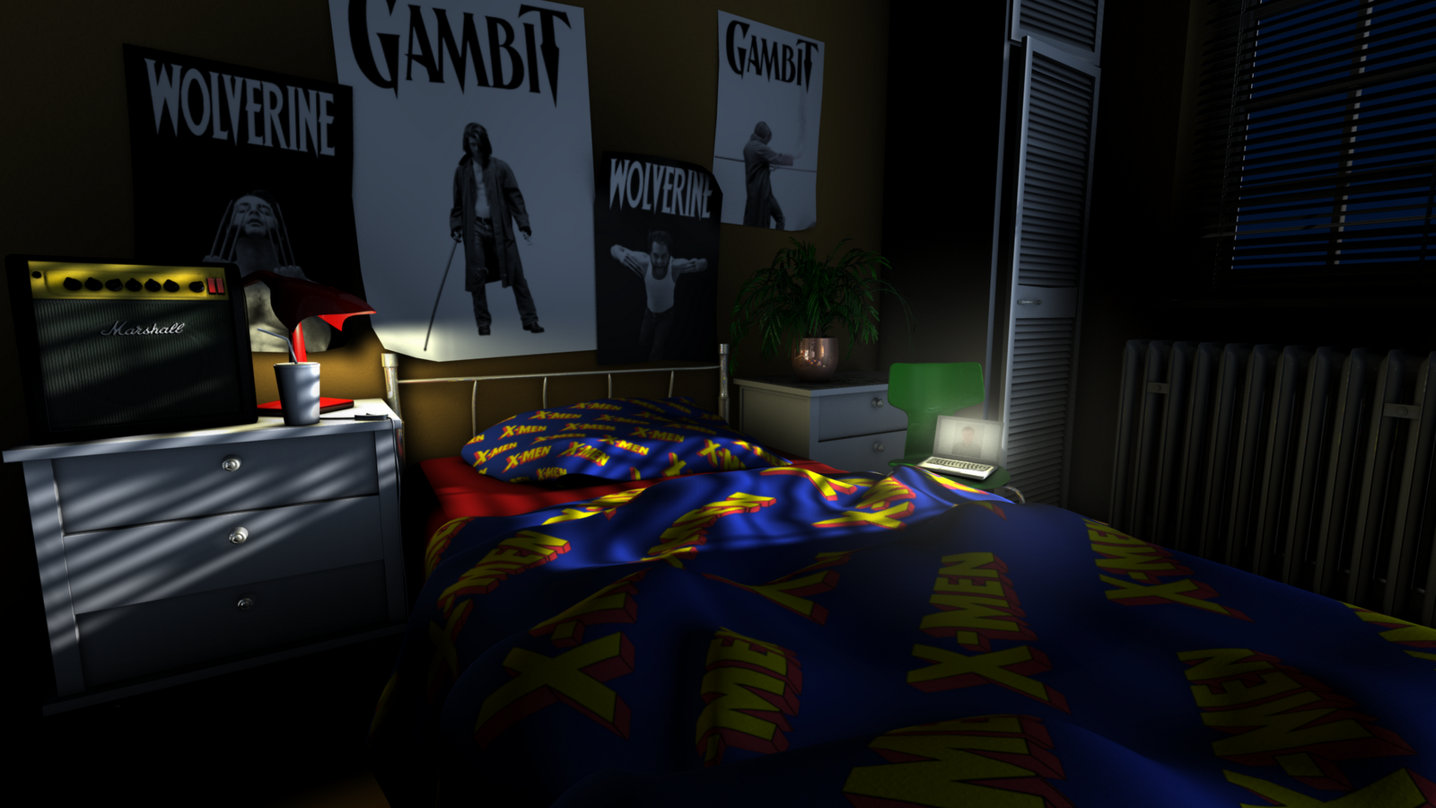
This is a final shot of room without the guitar.


This is a final detail of the amp.


This is the ambient occlusion pass. A fellow class mate showed an extremely simple way to make this pass possible. It added very subtle detail but in my opinion necessary. It really added depth to the blinds and made the guitar strings seem to pop!


This is a view of the bedroom from Maya.


I never had a Marshall amp but I always wanted one to go with my guitars. This bedroom scene was my chance to finally have one. I really wanted the amp to look as real as possible so I researched all the proper textures. The amp probably took me the most time to complete, because it seemed that my mania knew no end!


This is the texture and bump map used for the amp screen. I really wanted the Marshall font to have the proper look and feel, so I made the font have a slight bevel that would show up only on the bump map. This is why the font looks raised and just like a real Marshall amp.


This is the texture that I made in Photoshop for the metal knob board of the amp. I wanted it to have the brushed gold look of a real Marshall amp.


This texture was painted in Photoshop after exporting the guitar body as an obj.
I wanted the guitar to look real but the problem was in how the model was made. The body and neck were all one piece, which in real life is not the way guitars are made. Knowing this I decided to make the whole guitar have an all wood finish because fret boards are not painted on guitars.


Image used for texture on bedspread and pillow case. This image was made in Photoshop.


Image used as bump map for walls.

Tuesday, March 2, 2010

The King's Treasure


Above is the final image of the King's Treasure. I wanted to make the goblet look as if it was filled with all of the diamonds, but was knocked over, so they all spilled out. The idea of the spill out was to really attract attention to the refraction of the diamonds. I also wanted the little bits of light in the scene to be mostly reflection and refraction with no visible source of light. I am happy overall with the look, but the true caustics and the coins still bother me.


The above picture is what the scene looks like in Maya. There were times when it was hard to see certain items because in the Maya view they were almost invisible. So, for positioning purposes, I would give them an opaque texture and then after they were placed properly in the scene, I would then apply the intended texture.


The above picture is what the caustic settings were put on in order to achieve the look that I have. I still don't have the true caustics from the diamonds but the settings that I have the caustics set on, are an improvement than the scene without them. I found that by pulling the scale down to almost nothing it made for a more realistic look with the specular and the refraction. If it was all the way up in the white, everything looked blown out and almost overexposed. This took some tweeking in order to make it look more real.


The above picture are the settings that I had for the diamonds. I decided to have a few different colors just to add some variation in the scene. I took the basic diamond texture and changed the colors. I also had to very carefully adjust the reflectivity, roughness, highlight size, and most of the refraction options under the raytracing menu. It was a combination of all of the adjustments that gave the final look, not just turning on refractions.


Most people on this project were having problems with the table cloth texture. It may not have been mentioned during the critique, but everyone was talking about it in the lab when they were working on it. Either the geometry was not right on the table, the normals were off, or I don't know what! All I know is I tried a few ways to make the table look good. I first tried to paint it in photoshop, but the level of detail just was not good enough. I then tried a bump map with the Maya cloth texture. Once, again, it wasn't detailed enough and it just looked extremely weird. I also tried to make the table reflective in some way. I put on some of the reflective textures that I already had, but it didn't seem to fit in with all of the other stuff on the table. I finally was able to get the table looking better by adding a bump map with the Maya leather texture. I adjusted the texture a bit to give the proper bump depth, and made the cells a bit smaller. It seems that sometimes, the simpler solutions are the better ones.


The above image is the graph network for one side of the coins. I tried to use real coin images, but they looked horrible. They were just too gray or too black to use a bump map on. So, I made my own image and it looks a lot better, I think. I still am not completely happy with the way the coins turned out, but I can't seem to get them much better than this.


The above image is the reverse side of the coin.


At first, I hated this project and didn't think I would be able to pull it off as well as I did. Each of these projects have really taught me more than I would have learned by myself. I find that while being in the studio while others work on the same project helps as well. One person will be working on a texture and ask another's opinion, or someone will send everyone a link to a good tutorial for making a texture or to help with lighting. The learning process is better this way then just reading a book.